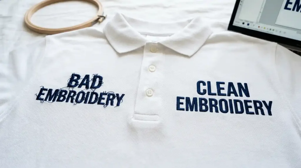
This guide covers every major reason why you need to fix jagged embroidery letters and exactly how to adjust your settings for a smooth finish.
This is one of the most frustrating problems in embroidery digitizing. The good news? Jagged letters are almost always fixable. They come from specific, identifiable causes and once you know what to look for, the solution is straightforward.
This guide covers every major reason why embroidery letters come out jagged and exactly how to fix each one.
Why Do Embroidery Letters Come Out Jagged?
Jagged letters in embroidery are not a machine problem. They are a digitizing problem. The machine does exactly what the file tells it to do. So, if the letters look rough and uneven on fabric, something in the digitizing settings needs to be adjusted.
The most common causes are:
- Letters are too small for the stitch type being used
- Wrong font selected for embroidery
- Stitch density is off
- No proper underlay set
- Pull compensation is missing or incorrect
Let’s fix each one.
Fix 1: Check Your Letter Size First
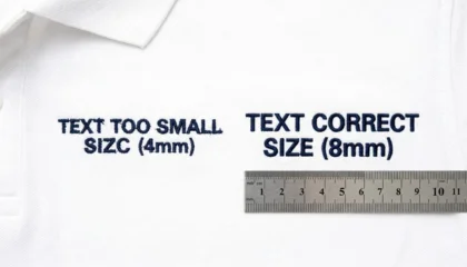
If your letters are too small, no amount of settings adjustment will produce clean stitching. Thread has physical thickness. Needles punch real holes into fabric. At very small sizes, there simply isn’t enough room for proper satin column formation.
Minimum safe sizes:
- Capital letters: at least 6mm tall
- Mixed case (caps + lowercase): at least 5mm tall
- All caps only: minimum 4mm, but go higher when possible
- Minimum column width (each bar of a letter): 0.8mm
If your design falls below these, the letters will always look jagged no matter what else you adjust. The first fix is simply to increase the letter height.
Fix 2: Use the Right Font for Embroidery
Not every font works in embroidery. Thin serif fonts, script fonts with hairline strokes, and decorative display fonts are designed for print not for thread.
Fonts that cause jagged letters:
- Thin serif fonts (strokes too narrow for satin stitches)
- Script fonts with very fine connections between letters
- Any font with stroke widths under 0.8mm
Fonts that embroider cleanly:
- Bold sans-serif fonts (Helvetica, Arial Bold)
- Block letters with even, uniform stroke widths
- Purpose-built embroidery fonts from your digitizing software
Pro Tip: If your client is sending you a custom font for their logo, use Vector Art Services first to clean up and redraw the letterforms at the right weight before digitizing. Thin strokes need to be thickened before they can hold clean stitches.
Fix 3: Set the Correct Stitch Type for Letters
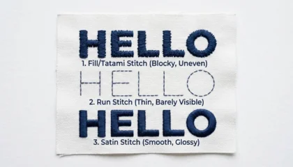
Most embroidery letters should be digitized with satin stitches. Satin stitches run cleanly across the width of each letter column and produce smooth, shiny edges.
Satin stitch works well for:
- Letter columns between 1.5mm and 10mm wide
- Outlined fonts and block text
- All standard cap and left-chest lettering
When satin stitch causes jagged edges:
- If the column is wider than 10mm, the stitches become too long and start to flop and loop
- If the column is narrower than 1.5mm, satin stitches crowd each other and look rough
Fix: For very large letter fills (over 10mm), switch to a split satin or fill stitch. For very thin strokes, use a running stitch instead.
Fix 4: Add the Right Underlay
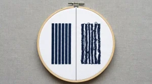
Underlay is one of the most skipped steps in lettering and it’s one of the main reasons letters look jagged on fabric.
Underlay stitches run underneath the top satin stitches. They stabilize the fabric so the top stitches land in the right place and don’t sink or shift.
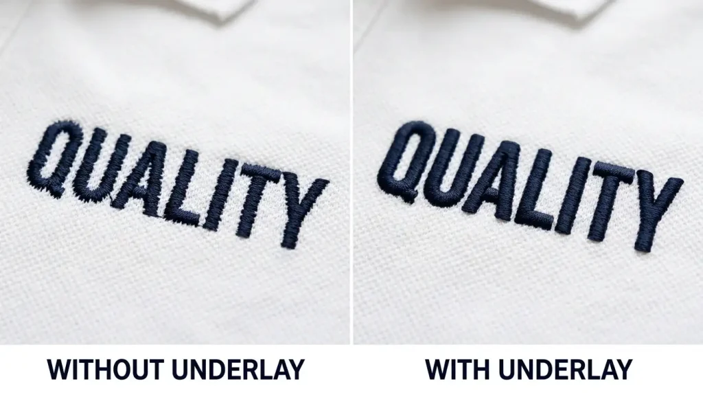
Underlay guide for letters:
- Under 5mm height: Skip underlay entirely it crowds the column and makes letters worse
- 6mm to 10mm height: Use center-run underlay one straight run stitch down the center of each column
- Above 10mm: Use edge-run underlay stitches run along both edges of the column before the satin covers it
Getting this wrong is the single most common cause of jagged, uneven letter edges on finished garments.
Fix 5: Adjust Pull Compensation
When an embroidery machine sews, the needle pushes down through the fabric, and the thread pulls the fabric slightly inward with every stitch. Over hundreds of stitches, this pull makes letter columns narrower than they were digitized and the edges end up looking uneven and jagged.
Pull compensation fixes this by making the digitized column slightly wider than needed, so that after the pull occurs during stitching, the final result is the correct width.
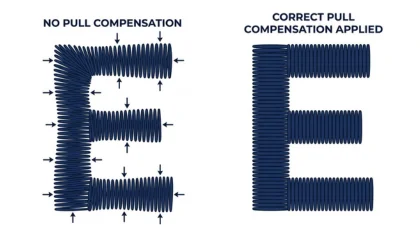
General pull compensation settings:
- Stable fabrics (twill, canvas): 0.3mm to 0.5mm
- Stretchy fabrics (polo, jersey, fleece): 0.5mm to 0.8mm
- Very thick fabrics (towels, heavy fleece): up to 1.0mm
If you are digitizing for cap and hat embroidery, increase pull compensation slightly the curved surface of a cap causes extra pull on every column.
Fix 6: Adjust Stitch Density
Stitch density controls how tightly packed the stitches are inside each column. If density is set too high, stitches crowd each other, the fabric puckers, and the letter edges look rough. If density is too low, the fabric shows through and the letters look thin and broken.
Standard density for lettering:
- Normal satin columns: 0.4mm to 0.45mm spacing between stitches
- Thin fabrics: go slightly lower density to avoid puckering
- Thick or looped fabrics (towels, fleece): go slightly higher density to push through the pile
Fix 7: Test on the Actual Fabric
The final and most important step is always a test sew-out on the exact fabric the customer will use. No software simulation fully replicates how thread behaves on real material.
Run the test. Check the letter edges. Look at the inside of the counters (the enclosed areas in letters like a, e, o, d) these are the first areas to close up when settings are wrong.
If the counters are filling in, reduce density slightly or increase letter size. If edges are jagged, recheck underlay and pull compensation.
Summary
Jagged letters in embroidery come down to a small set of fixable settings:
- Keep letters above the minimum size for your stitch type
- Choose fonts with even, thick strokes not decorative print fonts
- Use satin stitches for columns between 1.5mm and 10mm
- Add the right underlay for your letter height
- Set pull compensation based on your fabric type
- Adjust stitch density to match the fabric weight
- Always test sew on the real garment before running production
Getting lettering right takes practice. If you are dealing with a complex logo, small fine text, or a high-volume order where you cannot afford test failures, professional digitizing is the smarter route.
At Sassy Digitizing, our digitizers handle lettering for all fabric types from flat chest logos to curved cap text and towel embroidery. Every file is tested and production-ready before delivery. Get a quote here.
About the Author
Keith Blair | Senior Quality Control (HOD) Keith Blair is the Head of Quality Control at Sassy Digitizing with 12 years of commercial embroidery experience. He specializes in stitch density optimization, pull compensation, and small lettering for complex production environments.