
Why Thickening Embroidery Letters Is Not Always the Fix (And What to Do Instead)

When a customer reviews a stitched logo, one of the most common requests is: “Can you beef up the words?” They usually mean the text looks too thin, weak, or not as bold as they expected. However, thickening embroidery letters the wrong way creates new problems instead of solving the original one. This guide explains […]
Why Small Embroidery Letters Look Bad and How to Fix Them
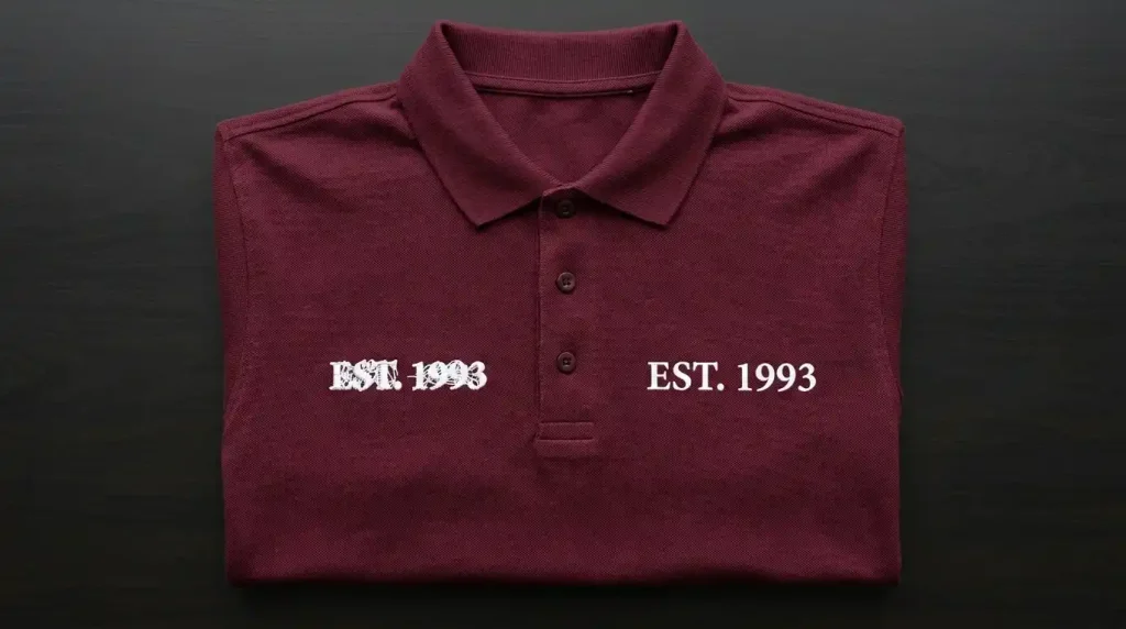
Small embroidery letters collapse into unreadable blobs for one reason: the digitizing settings are wrong for the size. The machine is not at fault. The thread is not at fault. Column width, font choice, and density settings cause every small letter failure. This guide explains each cause and gives you the specific fix. Why Small […]