Too Much Push in Embroidery: How to Fix Fabric Distortion
Your design looked perfect on screen. But the moment it came off the machine, the fabric around it was wavy, pushed outward, and nothing sat flat. Sound familiar? This is one of the most common and most misunderstood problems in embroidery production. The cause is almost always too much push, and the fix is simpler […]
Why Thickening Embroidery Letters Is Not Always the Fix (And What to Do Instead)
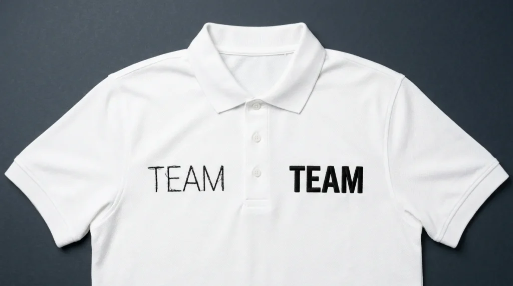
When a customer reviews a stitched logo, one of the most common requests is: “Can you beef up the words?” They usually mean the text looks too thin, weak, or not as bold as they expected. However, thickening embroidery letters the wrong way creates new problems instead of solving the original one. This guide explains […]
How to Fix Cap Logo Embroidery: Resize and Contain Fill Stitches Correctly
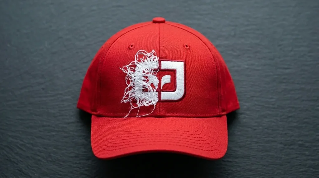
When you need to fix cap logo embroidery fill stitches that are overflowing the border, bleeding outside the outline, or simply looking too large or too small for the cap panel the problem is almost always in the digitizing file, not the machine. Cap embroidery has specific requirements that flat garment embroidery does not, and […]
Backpack Puckering Due to Spongy Material
If you have ever tried to embroider a logo onto a backpack and ended up with a wrinkled, puckered mess around the design, you already know how frustrating it can be. Spongy, padded backpack materials are one of the trickiest surfaces in the embroidery world, and the fix is not as simple as just tightening […]
How to Fix Oval or Gapped Logos on Unstructured Hats
It Still Has a Gap and Looks Oval Instead of Round Why Logos Distort on Thin, Unstructured Hats Customers often notice that a logo which should be perfectly round ends up looking oval after stitching. They may also see small gaps in the design, especially when the logo is applied to very thin, unstructured […]
How to Thicken Embroidered Text: The Right Way
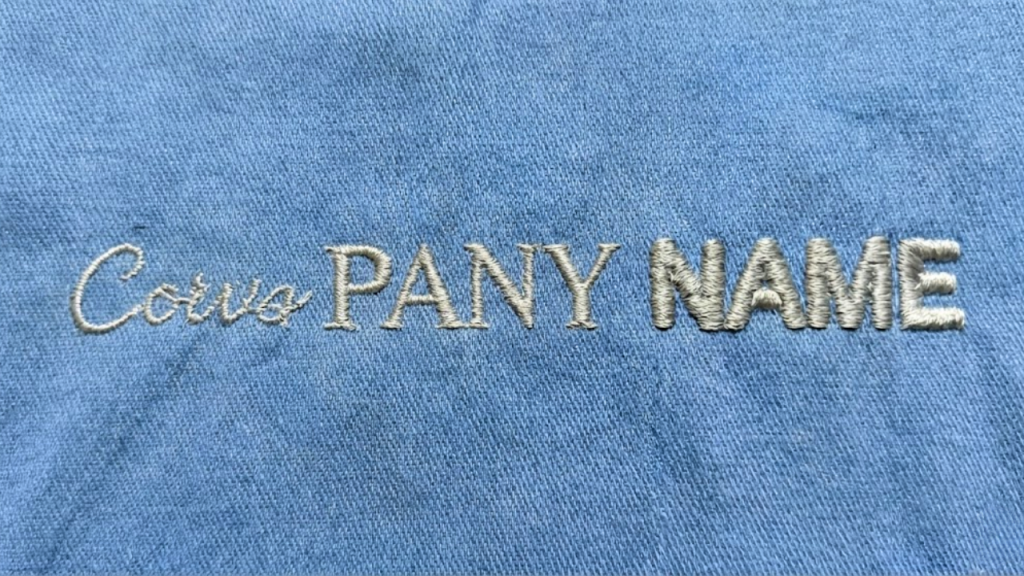
“Can You Beef Up the Words?” Why Thickening Letters Isn’t Always the Best Fix in Embroidery When reviewing a stitched logo, customers often say: “Can you beef up the words?” They usually mean the text looks too thin, weak, or not as bold as expected. While thickening letters can help in some cases, doing […]