
Cleaning up jump stitches and improving font quality in embroidery are two problems that almost always appear together. The text looks messy, there are long trailing threads crossing between letters, and the lettering edges look fuzzy and unprofessional even when the machine is running perfectly.
The root cause is not your machine and it is not your thread. It is the digitizing file. Jump stitches happen when the digitizing does not use proper trimming commands between letter elements. Poor font quality happens when the stitch settings density, underlay, and stitch length are not matched to the font size being embroidered.
In this guide, we walk through every cause and every fix, step by step, so your embroidery text comes out clean and sharp every single time.
What Are Jump Stitches and Why Do They Happen?
A jump stitch is the long, unsecured thread the machine produces when it moves from one part of a design to another without cutting the thread. In text embroidery, jump stitches appear between letters, between words, and between the different fill sections inside each letter.
Jump stitches are a digitizing problem, not a machine problem. The digitizing file must contain trim commands that tell the machine to cut the thread before traveling to the next element. Without those commands, the machine simply carries the thread across and that long trailing thread shows up on the finished garment.
What Causes Poor Font Quality in Embroidery?
Poor font quality fuzzy edges, thin letters, uneven fill, illegible small text comes from a different set of digitizing mistakes:
Font size too small for the stitch type used. Satin stitch letters below 4mm height cannot hold their shape. The needle path is too narrow and the stitches pile on top of each other rather than laying flat.
Wrong density for the fabric. Too low a density leaves gaps showing the fabric through the letter fill. Too high a density causes the fabric to pucker and the letter edges to harden and crack.
Missing or wrong underlay. Without underlay beneath the letter fill, the top stitches sink into the fabric fibers especially on fleece, terry cloth, and pique polo fabric and the letter loses its sharp edge.
Step-by-Step: How to Fix Jump Stitches and Improve Font Quality
Step 1: Add Trim Commands Between Every Letter Element
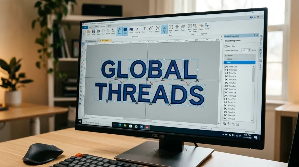
Open your digitizing file and go through every letter in the design. Between each letter element and between each section inside letters that have multiple parts like the letter B or R there must be a trim command.
In Wilcom: Select the connection between two letter elements, right-click, and set the connection type to “Trim and Jump.” Do this for every letter-to-letter transition in the design.
Check inside compound letters. Letters like B, P, R, A, and O have enclosed sections. The machine must trim after finishing the outer path before stitching the inner enclosed area. If this trim is missing, a jump stitch will cross through the center of the letter visibly.
Set a minimum jump length to auto-trim. Most digitizing software allows you to set a maximum jump stitch length any jump longer than this value is automatically replaced with a trim command. Set this to 3mm or less for text designs.
Note: If you are working with a file that was auto-digitized or converted from a font software, trim commands are often missing entirely. This is the most common reason text embroidery comes out with trailing threads everywhere. Professional embroidery digitizing always includes proper trim placement from the start.
Step 2: Check and Adjust Font Size vs Stitch Type
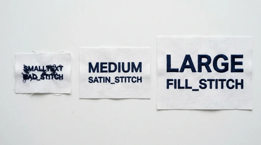
Match your stitch type to your font size using these rules:
Below 4mm letter height: Do not use satin stitch. Letters this small must be stitched as a running stitch outline only. Satin stitch at this scale causes thread buildup and unreadable letters.
4mm to 12mm letter height: Satin stitch is the correct choice. This is the ideal range for satin stitch lettering the columns are wide enough to lay flat and narrow enough to stay sharp.
Above 12mm letter height: Switch to fill stitch with a satin border outline. Pure satin stitch at large sizes creates loose, floppy columns that snag and look uneven. A fill stitch body with a clean satin outline gives the best result.
Pro Tip: If a customer requests very small text initials under 5mm or fine print under the main logo always flag this before digitizing. Text this small needs specialty handling or it will not be legible after stitching.
Step 3: Set the Right Density for the Fabric
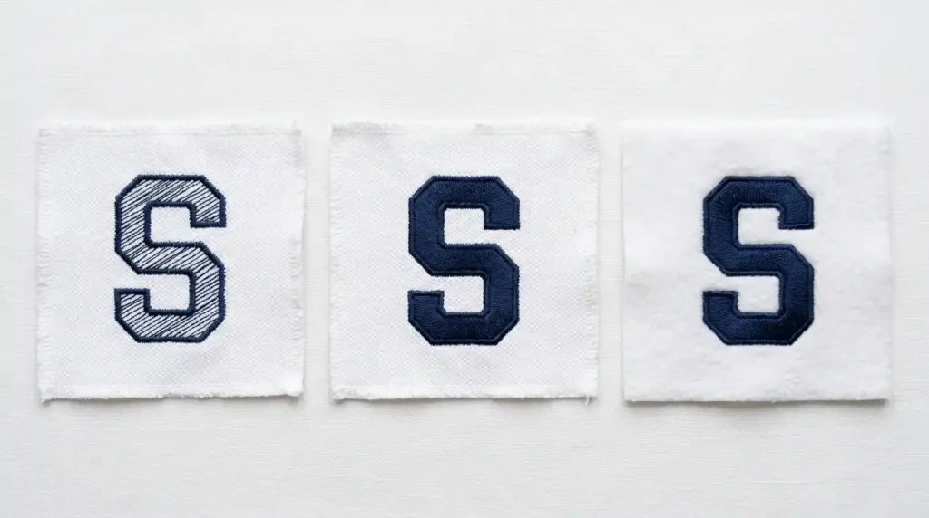
Density is the number of stitch rows per millimeter inside your letter fill. Getting this right is critical for clean font quality.
For standard woven fabrics (cotton, polyester shirts): Use a density of 0.4mm to 0.45mm (approximately 4 rows per mm). This gives solid coverage without puckering.
For pique polo fabric: Use 0.38mm to 0.42mm density. Pique has a textured surface that needs slightly tighter density to prevent the fabric texture from showing through the letter fill.
For fleece and knit fabrics: Use 0.45mm to 0.5mm density combined with a stronger underlay. The pile surface absorbs stitch rows you need more density to get the same coverage you would get on a flat woven fabric.
For caps: Use 0.42mm to 0.48mm. The structured cap fabric and the cap frame resistance mean letters need tighter density to sit flat on the curved surface.
Step 4: Add the Correct Underlay for Text Elements
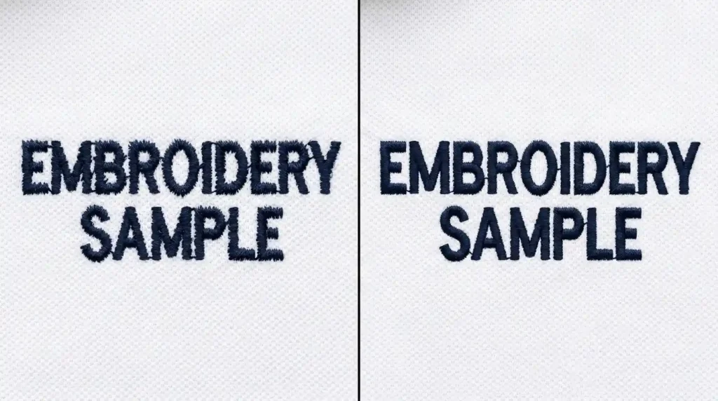
For text and lettering in embroidery, underlay is what creates sharp, defined letter edges. Without it, the top stitches sink into the fabric and the letter looks soft and fuzzy no matter how good the rest of the digitizing is.
For satin stitch letters (4mm–12mm): Use a single center-run underlay. One running stitch down the center of each letter column stabilizes the fabric and gives the satin stitches a foundation to sit on.
For fill stitch letters (above 12mm): Use a double-zigzag underlay. The zigzag pattern covers the entire letter area and flattens the fabric before the top fill stitches land.
For text on fleece or terry cloth: Add a layer of water-soluble stabilizer on top of the fabric before stitching. This prevents the needle from pushing the top stitches down into the pile, which destroys letter sharpness completely on these fabric types. You can also read more about this in our guide on why your embroidery is sinking.
Step 5: Trim and Test Manual Cleanup After Stitching
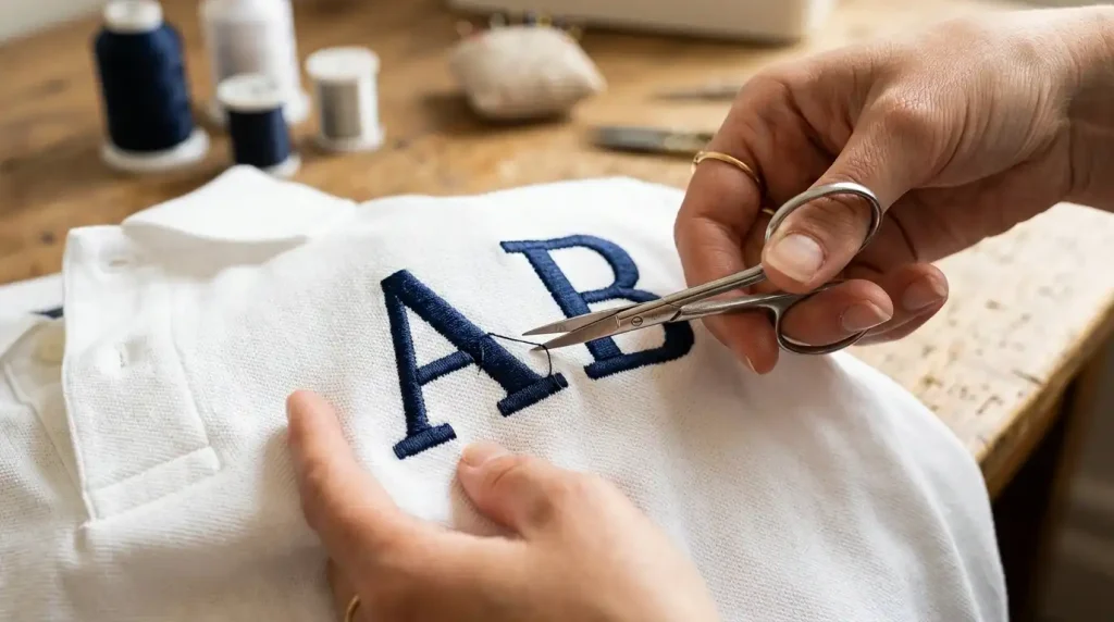
Even with correct trim commands in the file, some small jump stitches may remain after stitching especially between very close letters or inside tight curves. Manual trimming is the final step for a truly professional finish.
Use small, sharp embroidery scissors not standard scissors. The blade must be fine enough to get between letters without catching the surrounding stitches.
Cut at the base of the thread, as close to the fabric surface as possible. Never pull a jump stitch thread pulling can loosen surrounding stitches or pull thread from inside the letter fill.
Check both sides of the garment. Jump stitch threads sometimes trail on the back of the fabric rather than the front. Check the back of every garment before packaging.
Use a thread burner for speed on production runs. A thread burner melts the thread cleanly at the surface without the risk of accidentally cutting surrounding stitches. It is faster than scissors for high-volume trimming.
When Auto-Digitized Font Files Are the Root Problem
Many embroiderers use font files that were auto-generated by embroidery software or downloaded from free online sources. These files are built for average fabric at average size they have no pull compensation, generic density values, one-size-fits-all underlay, and often zero trim commands between letters.
If you have worked through every step above and your text is still coming out with jump stitches or poor quality, the font file itself needs to be rebuilt properly for your specific fabric, size, and application. This is exactly where Sassy Digitizing makes the difference. Every text and lettering file we produce is manually digitized with correct trim commands, proper density, matched underlay, and size-appropriate stitch types so your text comes out clean and sharp from the very first run.
Visit our digitizing services page or contact us for a free quote on your lettering project.
Quick Fix Checklist
- ✅ Trim commands added between every letter element
- ✅ Trim commands added inside compound letters (B, P, R, A, O)
- ✅ Auto-trim set to 3mm or less in digitizing software
- ✅ Stitch type matched to font size (running / satin / fill)
- ✅ Density matched to fabric type
- ✅ Correct underlay added for text elements
- ✅ Manual trimming done at base of any remaining jump threads
- ✅ Back of garment checked before packaging
Summary
Cleaning up jump stitches and improving font quality in embroidery always comes down to the same set of fixes: trim commands in the digitizing file, stitch type matched to font size, density matched to fabric, and correct underlay beneath every letter. Work through these five steps and your embroidery text will come out clean, sharp, and professional every time.
For font files that were auto-digitized or downloaded and are producing consistent quality problems, the file needs to be rebuilt from scratch. Sassy Digitizing builds every lettering file manually so your text stitches cleanly on the first run no trailing threads, no fuzzy edges, no wasted garments.
About the Author
Keith Blair | Senior Quality Control (HOD) Keith Blair serves as Head of Department for Quality Control at Sassy Digitizing, with 12 years of commercial embroidery experience. He specializes in stitch density, pull compensation, and digitizing standards for complex designs including small lettering, 3D puff, and appliqué.