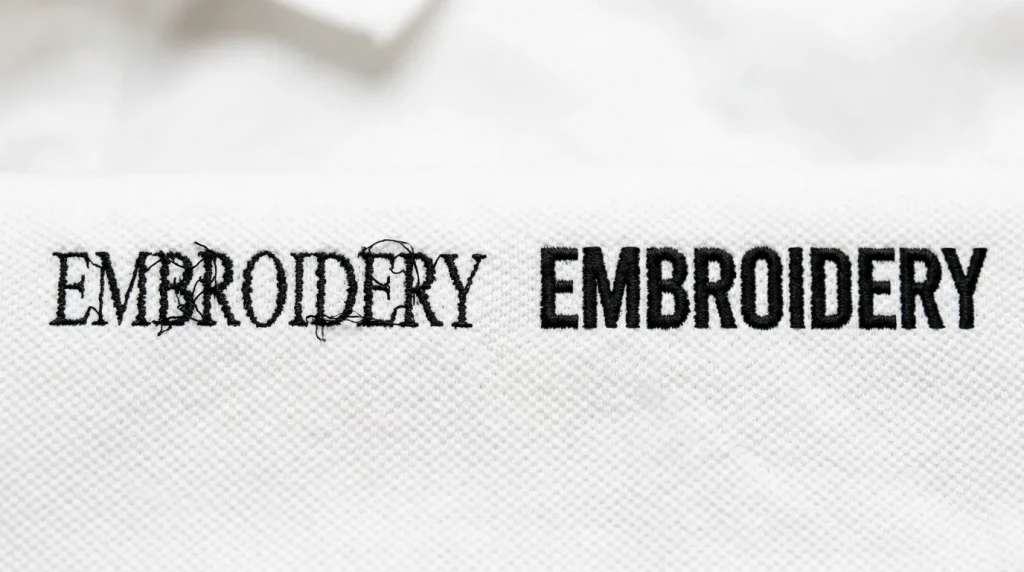
When a customer reviews a stitched logo, one of the most common requests is: “Can you beef up the words?” They usually mean the text looks too thin, weak, or not as bold as they expected. However, thickening embroidery letters the wrong way creates new problems instead of solving the original one. This guide explains why thin text happens, what goes wrong when you simply increase thickness, and how a professional digitizer strengthens text correctly.
Why Embroidered Text Looks Too Thin
Thin, weak embroidery text almost always comes from the digitizing file not the machine. Four specific settings cause text to look thin after stitching:
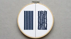
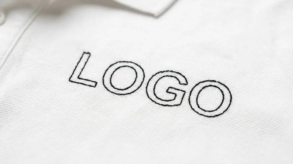
Incorrect stitch type using a running stitch outline instead of satin stitch for the letter strokes creates text with no fill coverage. The result looks like a thin sketch rather than bold embroidery.
Low stitch density row spacing set too wide means the thread does not fully cover the letter stroke surface. Additionally, gaps between stitch rows make the letters look faded and unconfident.
No pull compensation without pull compensation, satin columns pull inward during stitching. As a result, the finished letters appear narrower than the digitized width.
Artwork not designed for embroidery thin script fonts and narrow condensed fonts work well in print. However, they translate poorly to thread because their strokes are too narrow to hold a minimum stitch column width.
Understanding the actual cause is essential. Furthermore, jumping straight to thickening without diagnosing the cause makes the problem worse rather than better.
Does Increasing Stitch Width Fix the Problem?
Simply increasing stitch width or density without adjusting the surrounding stitch structure creates four new problems immediately:
Letters merge together wider letter strokes reduce the physical space between adjacent letters. When that space disappears, individual letters become one unreadable mass of thread.
Thread breaks increase additionally, over-dense stitching forces the needle through compacted thread layers. The resistance builds until thread breaks occur consistently in the same area.
Clean edges disappear wider columns without adjusted pull compensation overflow their boundaries. Therefore, the edges look ragged and unprofessional rather than sharp and bold.
Embroidery becomes stiff too many stitches in too small an area creates a rigid, raised surface. Furthermore, stiff embroidery catches on things and deteriorates faster with washing.
Increasing thickness without adjusting stitch structure is like adding more paint without fixing the brush. The result looks worse not better. This is the same principle behind why fill stitches leak outside the outline when density increases without boundary adjustments.
The Right Way to Strengthen Embroidered Words
A professional embroidery digitizer strengthens text by adjusting multiple settings together not just one value in isolation. Here is the correct process:
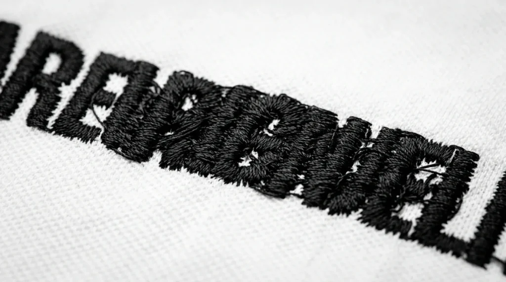
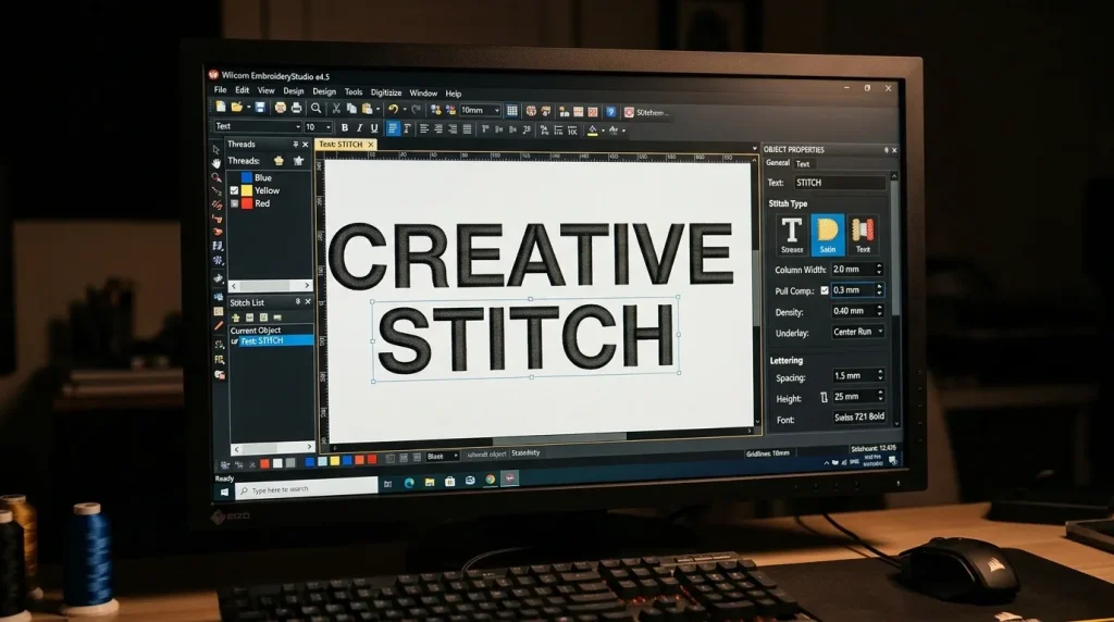
Step 1 Select the correct stitch type For most embroidery text, satin stitch produces the cleanest result. However, for letters wider than 6mm, switching to fill stitch provides better coverage without the splitting and sagging that wide satin columns create.
Step 2 Set pull compensation correctly Pull compensation widens each stitch column slightly to compensate for fabric contraction during stitching. For woven fabrics like polo shirts, set pull compensation between 0.3mm and 0.4mm. This ensures the finished letters appear at their intended width rather than pulling narrower.
Step 3 Adjust letter spacing Increase tracking by 10% to 15% when widening letter strokes. This maintains clear separation between adjacent letters even as individual strokes become bolder. Without this adjustment, wider strokes immediately cause merging.
Step 4 Control density Set row spacing to 0.4mm to 0.45mm for standard woven fabrics. Additionally, avoid stacking multiple underlay types one correctly set underlay provides better results than two competing layers. These same density principles apply whenever fixing gaps in embroidery fill stitches across any design element.
Why Font Choice Matters in Embroidery
Font selection determines whether embroidery text succeeds or fails at any size. Not all fonts translate from screen to thread.
Fonts that cause problems in embroidery: Thin serif fonts create stroke widths under 1mm at most embroidery sizes. Sharp decorative serifs collapse entirely because the needle cannot stitch them as individual elements. Condensed fonts place letter strokes dangerously close together, making merging almost inevitable at normal embroidery sizes.
Fonts that work in embroidery: Bold sans-serif block fonts have uniform stroke widths throughout every letter. Furthermore, they maintain maximum column width at every point in every letterform. Script fonts can work at larger sizes however, they require a minimum letter height of 8mm to 10mm to prevent connecting strokes from merging.
Sometimes the best fix is font substitution rather than thickening. Replacing a thin decorative font with a bold block font of the same size immediately produces stronger, cleaner text. Additionally, this approach requires no density changes and creates no merging risk.
Font decisions directly affect whether small embroidery letters stitch cleanly at any size the font choice and the stitch settings must work together.
What to Check Before Requesting Bolder Text
Before asking a digitizer to make text bolder, consider these four factors. Each one affects what is actually possible at the final production size.
Final logo size text that looks thin at 4 inches may already be at maximum safe column width at 1.5 inches. Furthermore, making it bolder at the smaller size causes immediate merging.
Fabric type thick textured fabrics like fleece or terry absorb stitches and make text appear thinner than it actually is. However, the fix in this case is adding a knockdown underlay not widening the letter strokes.
Stitch direction and flow satin stitch columns that run perpendicular to a curved garment seam appear thinner optically due to light reflection. Adjusting the stitch angle by 10 to 15 degrees often makes text appear bolder without changing a single column width value.
Machine limitations some older machines produce slightly inconsistent tension at high density settings. Therefore, bolder text on these machines requires lower density to maintain consistent stitch quality rather than higher density.
Text that looks bold on screen may already be at the maximum safe thickness for stitching. Additionally, a professional digitizer evaluates all four factors before making any changes rather than simply increasing one value.
Professional Digitizing vs. DIY Thickening
Adjusting embroidery text correctly requires professional digitizing software and an understanding of how each setting affects the others. Basic machine software does not offer independent control over pull compensation, minimum column width, letter spacing tracking, or underlay type.
Auto-digitizing tools apply generic settings that do not evaluate font suitability, fabric behavior, or production constraints. As a result, auto-digitized text either stays too thin or merges when thickness is increased because the surrounding settings were never calibrated for the specific design.
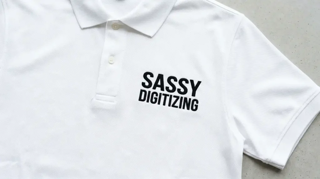
At Sassy Digitizing, our digitizers evaluate every text element before making any adjustments. They check font suitability, column width, pull compensation, letter spacing, and density simultaneously. Moreover, our team uses Wilcom software with manual control over every setting which is why manual digitizing consistently produces better text results than AI auto-digitizing.
If your logo text looks too thin or breaks apart in production, our embroidery digitizing service makes it bold, readable, and production-ready. Check our pricing and get your text fixed correctly from the first run.
Summary
Thickening embroidery letters solves the problem only when done correctly. Here is what actually works:
- Diagnose the real cause first stitch type, density, pull compensation, or font choice
- Switch to satin stitch for narrow text and fill stitch for wide text over 6mm
- Set pull compensation to 0.3mm to 0.4mm for woven fabrics
- Increase letter spacing tracking by 10% to 15% when widening strokes
- Replace thin decorative fonts with bold sans-serif alternatives
For embroidery text that is bold, clean, and production-ready from the first run, Sassy Digitizing handles every setting manually. Visit our digitizing services page to get started today.
FAQs
1. Why does my embroidery text look thin after stitching? Thin embroidery text comes from the wrong stitch type, low density, missing pull compensation, or a font that is too narrow for embroidery. Each cause needs a specific digitizing fix not simply increasing the stitch width.
2. Can I make embroidery letters bolder without them merging? Yes but only by adjusting stitch type, pull compensation, letter spacing, and density together. Increasing stitch width alone without adjusting letter spacing causes immediate merging between adjacent letters.
3. What fonts work best for bold embroidery text? Bold sans-serif block fonts produce the cleanest bold embroidery text. They have uniform stroke widths, no thin serif elements, and maintain maximum column width throughout every letterform.
4. Does fabric type affect how bold embroidery text looks? Yes. Thick textured fabrics absorb stitches and make text appear thinner. Additionally, stitch direction relative to the garment surface affects how light reflects off the thread making text appear thinner or bolder depending on the angle.
About the Author
Keith Blair | Senior Quality Control (HOD) Keith Blair serves as the Head of Department for Quality Control at Sassy Digitizing, bringing 12 years of commercial embroidery experience to the team. He specializes in stitch density, underlay construction, and pull and push compensation adjustments across all fabric types ensuring every digitized file is production-ready before it reaches the customer.