
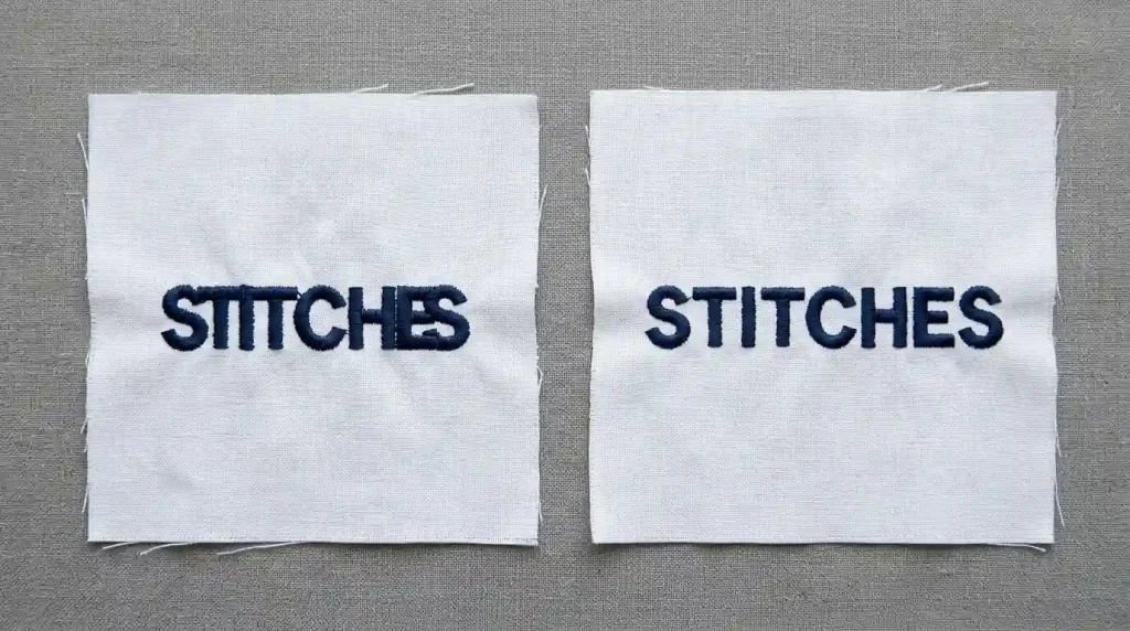
Fixing poorly stitching letters in embroidery is one of the most common challenges for embroidery operators at every level. The letters look fuzzy, the fill is uneven, the edges are soft instead of sharp, or the text is simply unreadable at the size it was requested. The machine runs fine the thread does not break, the hoop does not shift but the finished lettering still looks unprofessional.
The problem is almost never the machine. Poorly stitching letters in embroidery trace back to the digitizing file specifically the density settings, underlay structure, stitch type selection, and letter spacing that were used when the file was built. Get those settings right and the letters stitch cleanly every time.
This guide covers every cause and every fix, step by step.
Why Embroidery Letters Stitch Poorly
Before fixing the problem, it helps to understand exactly what is going wrong. Poorly stitching letters in embroidery fall into these specific categories:
Fuzzy or soft edges: The letter outline is not sharp. The edge of each letter bleeds into the surrounding fabric instead of sitting clean and defined.
Gaps in the fill: You can see the fabric through the letter body. The stitch rows are too far apart to give solid coverage.
Thin or collapsed letters: The letter has lost its shape. Thin strokes have disappeared or merged together.
Uneven letter spacing: Some letters sit too close together, others too far apart, making the text look unbalanced.
Puckering around letters: The fabric is pulling and bunching around the text, distorting the letter shapes.
Each of these problems has a specific cause and a specific fix.
Step-by-Step: How to Fix Poorly Stitching Letters in Embroidery
Step 1: Check the Font Size Against the Stitch Type
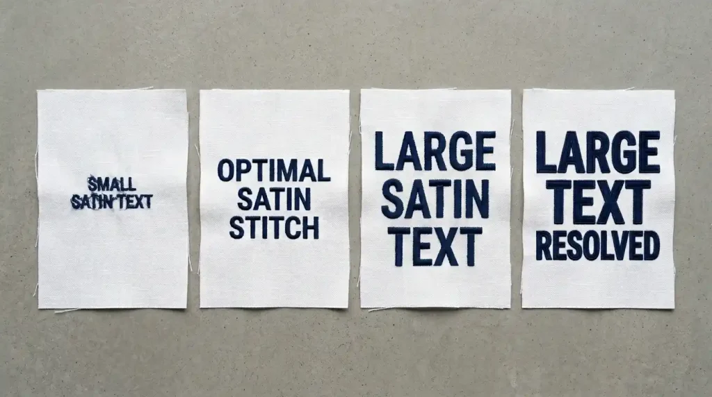
The single most common cause of poorly stitching letters in embroidery is using the wrong stitch type for the font size. Open your digitizing file and check every text element against these rules:
Below 4mm letter height: Satin stitch will not work at this size. The columns are too narrow and the thread piles on top of itself. Use a running stitch outline only a single or double run tracing the letter shape is the only stitch that stays clean at this scale.
4mm to 12mm letter height: This is the correct range for satin stitch lettering. Columns are wide enough to lay flat, narrow enough to stay sharp. This is where most embroidery text should live.
Above 12mm letter height: Switch from satin stitch to fill stitch for the letter body, with a satin stitch border outlining each letter. Pure satin stitch above 12mm produces loose, floppy columns that snag, look uneven, and compress unevenly after washing.
Pro Tip: If a customer requests very small text initials under 5mm, fine print, or secondary text lines flag this before digitizing. Text this small needs specialty handling or it will not be legible on the finished garment.
Step 2: Fix the Stitch Density
Density controls how many stitch rows sit inside each letter per millimeter. Wrong density is what causes gaps in the fill or puckering around the letter edges.
Open your digitizing file and adjust density per fabric type:
Standard woven fabric cotton and polyester shirts: Set density to 0.40mm to 0.45mm. This gives solid coverage without pushing the fabric.
Pique polo fabric: Set density to 0.38mm to 0.42mm. The textured surface of pique needs slightly tighter rows to cover the weave pattern beneath.
Fleece and knit fabrics: Set density to 0.45mm to 0.50mm. The pile surface absorbs stitch rows more density is needed to achieve the same coverage you get on flat woven fabric.
Structured cap fabric: Set density to 0.42mm to 0.48mm. Cap fabric under cap frame tension resists the needle more than flat-hooped fabric tighter density compensates for this.
Note: If your lettering file came from auto-digitizing software or a downloaded font file, density is almost always set to a generic average value that does not match your specific fabric. This is one of the primary reasons auto-digitized text looks poor on professional garments. A manually digitized file from Sassy Digitizing sets density specifically for your fabric and application.
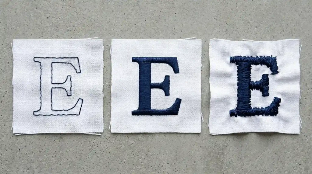
Step 3: Add the Correct Underlay for Letter Elements
Underlay stitches are invisible in the finished embroidery but they are what gives every letter its sharp edge and solid fill. Without underlay, the top stitches have no foundation they sink into the fabric fibers and the letter loses definition.
Apply the correct underlay type for each text element:
Satin stitch letters (4mm to 12mm): Use a single center-run underlay. One running stitch path down the center axis of each letter column stabilizes the fabric and gives the satin stitches a defined track to follow.
Fill stitch letters (above 12mm): Use a double-zigzag underlay. The zigzag pattern covers the entire letter body and compresses the fabric surface before the top fill stitches land.
Text on fleece or terry cloth: Add a layer of water-soluble stabilizer on top of the fabric before stitching. The stabilizer prevents the needle from pushing stitches down into the pile without it, even correct underlay settings cannot prevent letters from sinking into thick pile fabrics. For a full explanation of why stitches sink, read our guide on why your embroidery is sinking.
Step 4: Fix Letter Spacing in the Digitizing File
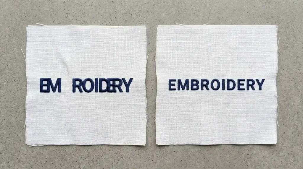
Letter spacing problems come directly from the digitizing file. They cannot be fixed at the machine level they must be corrected in the software before the file is sent to the machine.
Open your digitizing file and check the spacing between each letter pair:
Minimum spacing: No letter should touch the adjacent letter at any point. If satin stitch columns from two adjacent letters overlap, they will merge during stitching and become unreadable.
Maximum spacing: The gap between letters should not exceed the stroke width of the letters themselves. If the gap is wider than the letter strokes, the word looks broken rather than continuous.
Consistent spacing across all letter pairs: The visual space between every pair of letters in the word should feel equal. Some letter combinations like AV, VA, WA, and TA need optical kerning adjustments because their shapes create visual gaps that look wider than they measure.
Pro Tip: After adjusting spacing in your digitizing software, zoom out to 50% view and read the text as a whole word. Spacing problems that are invisible at 100% view become immediately obvious at 50% view.
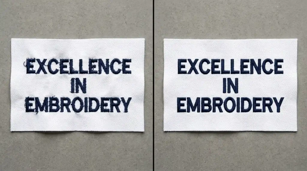
Step 5: Fix Puckering Around Letter Edges
Puckering around embroidery letters means the fabric is being pulled inward by the thread tension during stitching. This distorts letter shapes, bunches the surrounding fabric, and makes the finished text look compressed and uneven.
Fix puckering around letters using this checklist:
Reduce density first. If density is above 0.45mm on a standard woven fabric, reduce it to 0.40mm and run a test. High density is the most common cause of letter puckering.
Check your stabilizer. Tear-away stabilizer on a stretch fabric or a thin fabric will not hold the fabric stable enough during stitching. Switch to cut-away stabilizer for any fabric that has stretch or movement. For more on stabilizer selection, see our guide on how to fix embroidery puckering on polyester polos.
Check pull compensation. If pull compensation is set too high in the digitizing file, the letter columns will be wider than designed and wider columns mean more thread density per area, which causes puckering. Reduce pull compensation to 0.4mm for standard woven fabrics and retest.
Re-hoop tighter. If the fabric moves during stitching, even slight movement causes the stitch rows to pile up unevenly and pucker the surrounding fabric. Re-hoop with the fabric pulled drum-tight before running the test again.
Step 6: Run a Test Stitch-Out and Measure
After making all adjustments in the digitizing file, always stitch a full test on the exact same fabric, stabilizer, and hoop setup you will use on the final garment. Never test on a different fabric and assume the results will transfer.
After stitching the test, check these three things before approving the file for production:
Letter edge sharpness: Run your fingernail lightly along the edge of a letter. A correctly stitched letter edge feels defined and slightly raised. A poorly stitched edge feels soft and blends into the fabric.
Fill coverage: Hold the test piece up to a light source. No light should pass through the letter fill. If you can see light through the fill, density needs to increase.
Letter dimensions: Use a small ruler or digital calipers to measure the stitched letter height and compare it to the designed height in your software. If the stitched letter is more than 0.5mm smaller than designed, your pull compensation needs to increase.
When the Font File Itself Is the Problem
If you have worked through every step above and letters are still stitching poorly, the font digitizing file itself is the root problem. Font files that were auto-generated, downloaded from free sources, or converted automatically from a text editor do not contain proper density, underlay, or spacing settings for professional embroidery. They are built to look correct on screen not to stitch correctly on fabric.
At Sassy Digitizing, every lettering and font file is manually digitized with the correct settings for your specific fabric, garment type, and letter size. This eliminates the guesswork and the wasted test garments. You can learn more about how we approach lettering quality in our guide on how to fix messy embroidery lettering.
Visit our digitizing services page or contact us for a free quote on your lettering project.
Quick Fix Checklist
- ✅ Stitch type matched to font size (running / satin / fill)
- ✅ Density matched to fabric type (0.38mm–0.50mm range)
- ✅ Correct underlay added (center-run for satin, zigzag for fill)
- ✅ Letter spacing checked no touching, no excessive gaps
- ✅ Pull compensation set correctly for fabric type
- ✅ Correct stabilizer matched to fabric (cut-away for stretch)
- ✅ Fabric hooped drum-tight with no movement
- ✅ Test stitch-out run and measured before final production
Summary
Fixing poorly stitching letters in embroidery always comes down to the same set of adjustments: stitch type matched to font size, density set for the specific fabric, correct underlay beneath every letter, proper letter spacing in the file, and the right stabilizer for the garment. Work through these six steps in order and your embroidery text will come out sharp, solid, and professional every single time.
For font files that are auto-digitized or built with generic settings, the file needs to be rebuilt correctly for your fabric and application. Sassy Digitizing manually digitizes every lettering file with the right settings from the start no fuzzy edges, no gaps, no wasted garments.
About the Author
Keith Blair | Senior Quality Control (HOD) Keith Blair serves as Head of Department for Quality Control at Sassy Digitizing, with 12 years of commercial embroidery experience. He specializes in lettering digitizing, stitch density, pull compensation, and production-ready file preparation for all fabric types.