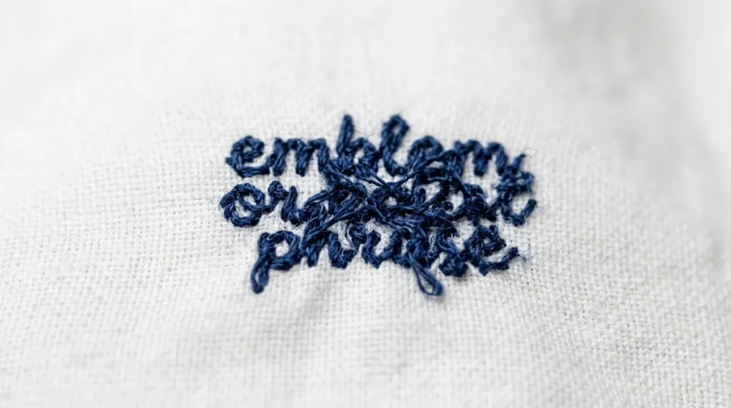
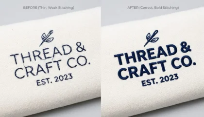
You ran a design and the result looks weak thin letters, washed-out lines, details that disappear from two feet away. The thread is there, but nothing pops. The culprit is almost always stitch thickness, and it is one of the most overlooked settings in embroidery digitizing.
This guide explains what stitch thickness is, why it affects visibility, and exactly how to fix it.
What Is Stitch Thickness in Embroidery?
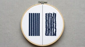
Stitch thickness refers to the width of the stitch column as it crosses the design surface. In embroidery, satin stitches and column stitches have a defined width set inside the digitizing file. Too narrow, and the stitch looks fragile and thin. Too wide, and threads bunch up and lose shape.
Getting this width right is what separates a sharp, professional result from a muddy, unreadable one.
Cause 1: Stitch Width Set Too Narrow
When stitch columns are digitized too narrow typically under 1.5mm the thread does not lay with enough body to reflect light properly. On textured fabrics like fleece, pique polo, or knit, thin stitches sink into the surface and become nearly invisible.
This commonly happens with:
- Logos that were auto-converted rather than manually digitized
- Designs scaled down from a larger size without adjusting stitch width
- Templates reused across different garment types without customization
Cause 2: Small Lettering With Default Settings
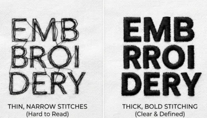
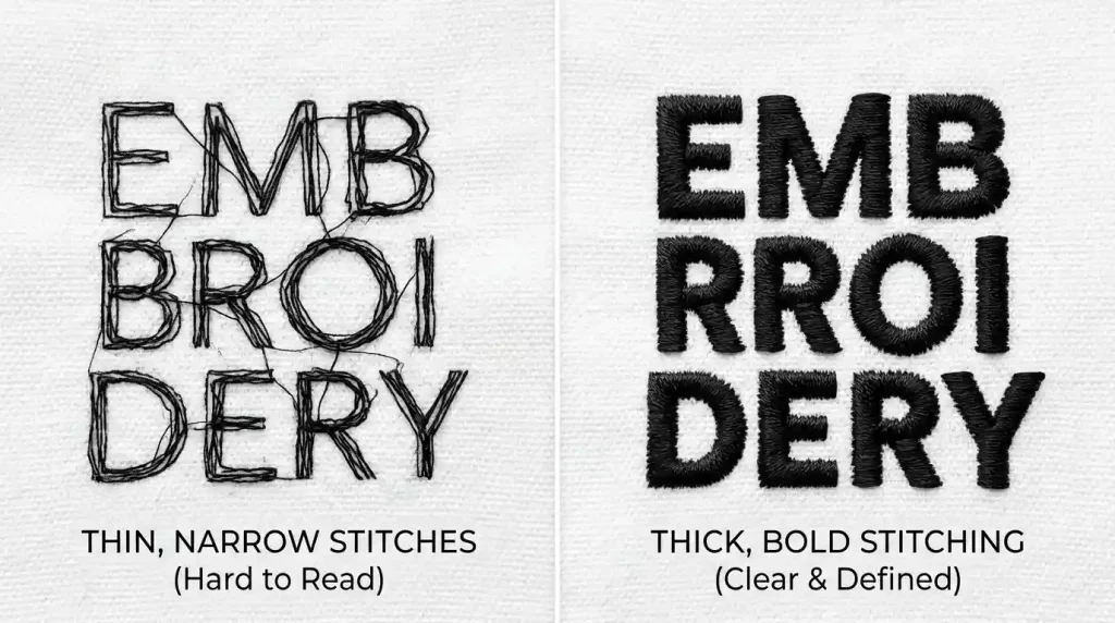
Small text is the hardest embroidery element to keep visible. Letters below 4mm in height have very little room for stitch columns, and if the width is not adjusted specifically for that size, letters merge, fill areas crowd, and the text becomes illegible.
Default digitizing settings are built for average-sized designs — they do not automatically compensate for small lettering. Every small text element needs manual stitch width adjustment to stay readable.
Pro Tip: For text under 4mm, switch from satin fill to a running stitch outline. It reads cleaner at tiny sizes than a packed satin column.
Cause 3: Wrong Stitch Type for the Fabric
Different fabrics need different stitch approaches. A satin stitch that looks perfect on a flat woven shirt will look thin and lost on a terry towel or a waffle-knit beanie. The fabric texture competes with the stitch and wins.
Fabric-specific stitch width guidance:
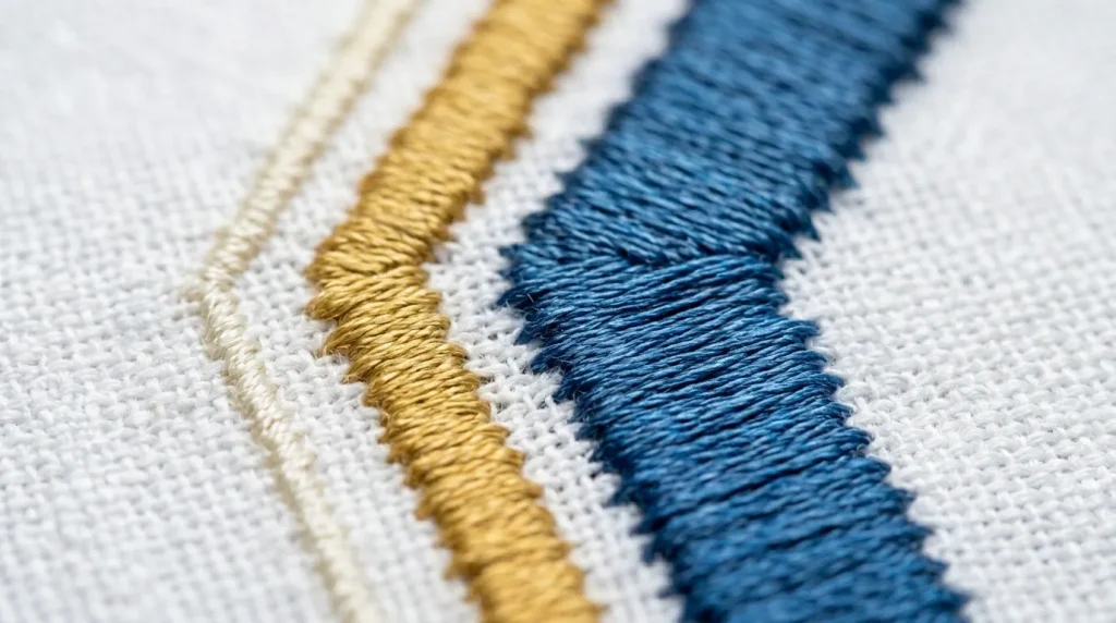
- Flat woven (shirts, caps): Standard satin width 2.0mm–4.0mm
- Knit and stretch (beanies, t-shirts): Increase width by 15–20%
- Terry and towel: Use thicker columns with strong underlay
How to Fix It: Step by Step
Step 1: Identify Which Elements Are Losing Visibility
Run a test stitch on scrap fabric. Mark which letters or design elements look thin or weak. These are the specific stitch columns that need width adjustment in the file.
Step 2: Adjust Column Width in the Digitizing File

Open the file in your embroidery software and select the problem elements. Increase the column or satin stitch width incrementally:
- Start with a +0.3mm increase on thin elements
- For small lettering, try converting to bean stitch or triple run
- Re-test after every adjustment before finalizing
If you do not have access to embroidery software, send the file to Sassy Digitizing for professional adjustment.
Step 3: Match Stitch Width to Fabric Type
Once width is corrected, confirm it is appropriate for the specific garment. A file built for a flat shirt will need re-adjustment before running on a beanie or towel. Always test on the actual production blank, not a substitute fabric.
Step 4: Check Pull Compensation
On stretch fabrics, stitches pull inward as the machine sews. This makes columns appear narrower than digitized. Add pull compensation of 0.3mm–0.5mm on stretchy garments so the final stitched width matches the intended design width.
DIY Adjustment vs. Professional Re-Digitizing
If only one or two elements look thin, a quick width adjustment may solve it. But if the entire design looks weak across multiple garments and fabric types, the file needs a full professional rebuild.
Sassy Digitizing manually builds every file with fabric-specific stitch widths, proper pull compensation, and visibility-tested settings. View our portfolio or contact us for a re-digitizing quote.
Summary
Stitch thickness in embroidery controls everything from letter legibility to design boldness. Thin stitches on textured fabrics, small lettering with default settings, and missing pull compensation are the three main causes of poor visibility. Fix the stitch width in the file, match it to the fabric, and test before full production.
Need a file rebuilt with correct stitch thickness for your specific garment? Contact Sassy Digitizing we will sort it out.
About the Author
Keith Blair | Senior Quality Control (HOD) Keith Blair is the Head of Quality Control at Sassy Digitizing with 12 years of commercial embroidery experience. He specializes in stitch width optimization, pull compensation settings, and fabric-specific digitizing to ensure every design runs with maximum clarity and visibility.