If you have ever embroidered text on a hat and the letters just disappeared into the fabric, you are not alone. Dark navy cap, dark thread, no background and suddenly your client’s logo is invisible from three feet away. This is one of the most common problems in cap embroidery digitizing, and it has a simple fix: adding a background layer behind your text.
In this guide, we will show you exactly how to do it, when to use it, and which background types work best for different cap colors and fabrics.
Why Text Loses Visibility on Hats
Hats are not flat surfaces. The curved crown, textured twill fabric, and center seam all affect how stitches sit. When text is sewn directly onto the hat fabric without a base, the fabric texture bleeds through the letters especially with light thread on a mid-tone background or dark thread on a busy pattern.
The result? Blurry, low-contrast lettering that looks unprofessional.
Adding a background fill underneath the text solves this by creating a clean, flat foundation for your letters to sit on.
When Should You Add a Background to Text?
Not every hat needs a background behind the text. Here is when it becomes necessary:
- The hat fabric and thread color are too similar in tone (e.g., black text on charcoal cap)
- The hat has a textured or heathered fabric that breaks up fine stitches
- The text is small (under 6mm letter height) and needs clean edges
- The design has multiple thread colors layered closely together
- The brand logo requires exact color accuracy against the hat
If any of these apply to your order, a background layer is not optional it is essential.
Types of Backgrounds You Can Add
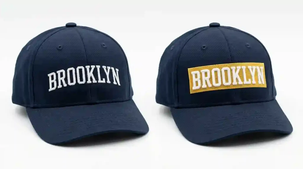
1. Satin Stitch Background
This is the most common and cleanest option. A satin-filled rectangle, oval, or custom shape is stitched first, then the text runs on top.
Best for: Structured caps, logos with defined shapes, high-profile hats.
Pro tip: Keep the satin background at least 2–3mm wider than your text on all sides so the letters have clear breathing room.
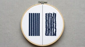
2. Fill Stitch (Tatami) Background
A tatami or cross-hatch fill stitch creates a softer, matte base. It is less shiny than satin and works better under larger text blocks or when the design covers a wide area.
Best for: Unstructured caps, lifestyle brands, vintage-style designs.
Note: Set your stitch density between 0.35mm and 0.45mm for a smooth fill that does not push through the fabric.
3. Underlay as Background
In some cases, a heavy underlay itself can act as a semi-background for very small lettering. This is not a true background but helps text sit up on the fabric with better definition.
Best for: Text under 5mm in height where a full background would look bulky.
This is exactly the kind of technical adjustment our team makes at Sassy Digitizing when handling small-text cap orders.
Step-by-Step: How to Digitize a Background Behind Hat Text
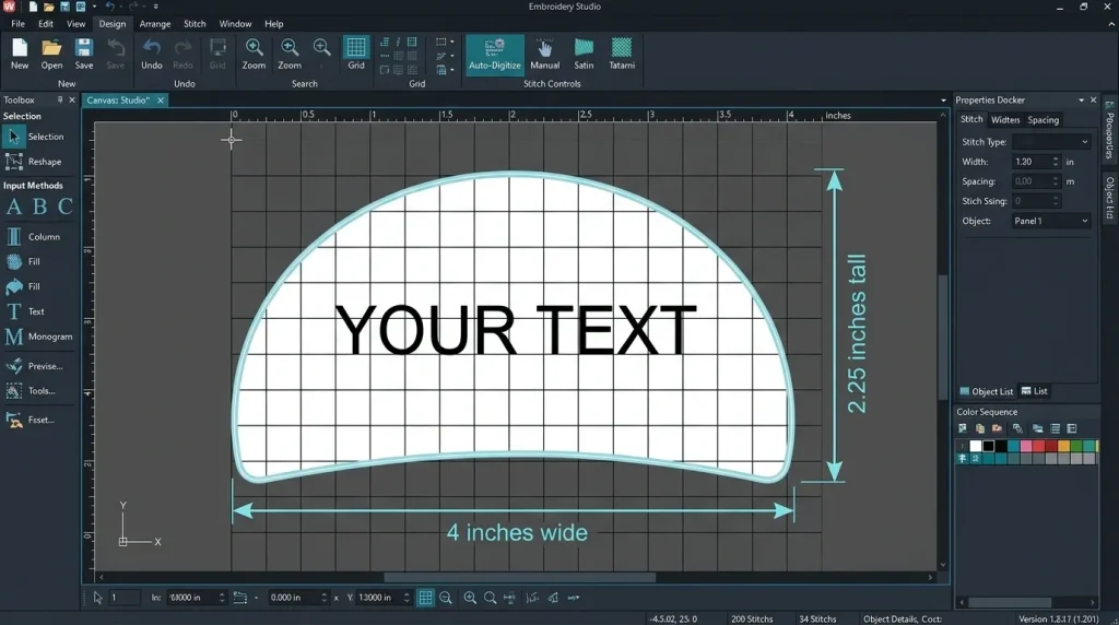
Step 1: Set Your Canvas for Cap Dimensions
Before anything, set your working area to match the hat’s embroidery field. For a standard structured cap, this is typically 4 inches wide by 2.25 inches tall. Do not exceed this height or the design will run into the crown during sewing.
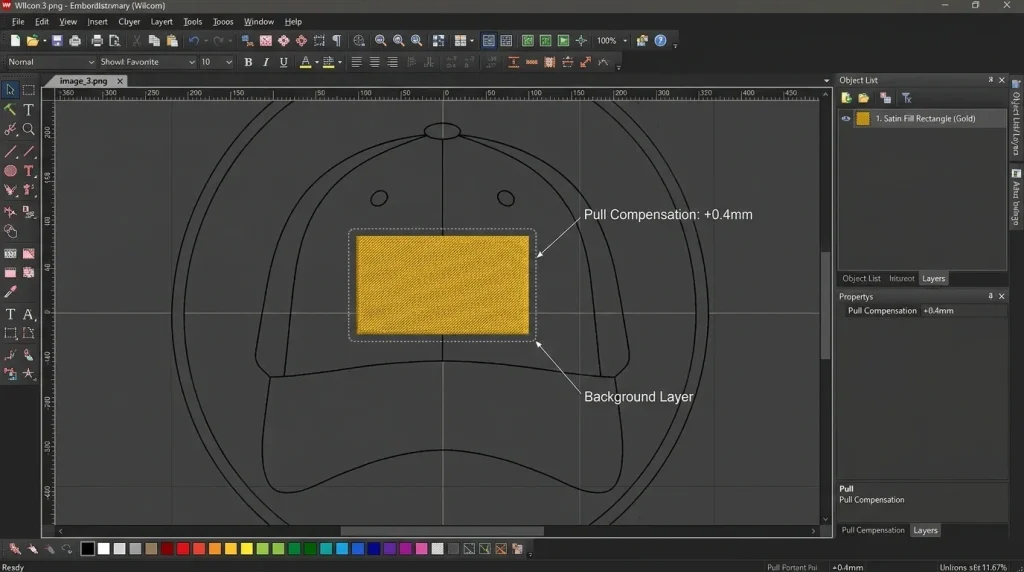
Step 2: Draw Your Background Shape First
Using your digitizing software (we use Wilcom at Sassy Digitizing), draw the background shape behind where your text will sit. Make it slightly larger than the text block on all sides.
If your text curves along the cap, the background should follow the same arc. A flat rectangle under curved text will look misaligned once sewn.
Stitch type for background: Satin or tatami fill Pull compensation for cap: Add 0.3mm–0.5mm to account for fabric stretch during sewing
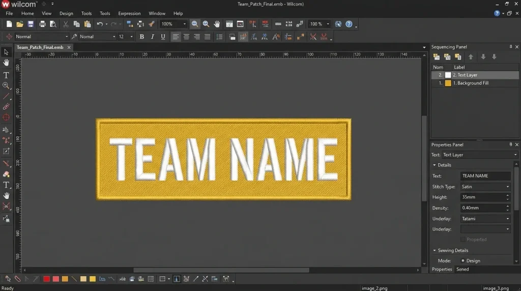
Step 3: Set Proper Stitch Order
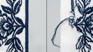
This is critical. The background must sew first, then the text runs on top. If the sewing order is reversed, the background stitches will cover and destroy your text.
In Wilcom, this means placing the background object at the bottom of your object stack. Always confirm your sewing sequence before saving the file.
Important: For cap embroidery, sew from the bottom up and from the center outward. This prevents the fabric from flagging and keeps registration tight across the seam.
Step 4: Add Text on Top of the Background
Now add your text layer. Use a satin stitch font for clean lettering at standard cap heights (6mm–12mm). For very small text, a run stitch or bean stitch outline may perform better than a heavy satin fill.
Make sure your text is centered both horizontally and vertically within the background shape. Any offset will look immediately obvious once sewn.
For high-contrast legibility, choose a thread color that is at least two tonal values apart from your background. For example: white text on navy background, black text on gold background.
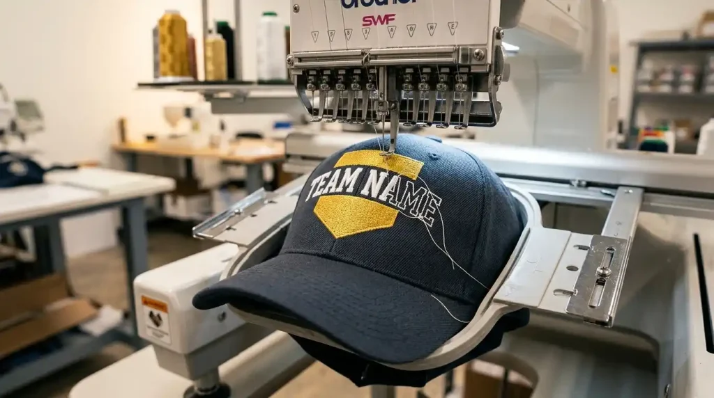
Step 5: Test Stitch on a Curved Surface
Before sending to production, always do a test sew on a similar cap fabric. A flat sew-out does not tell you how the design will behave on the curved cap crown.
Check for:
- Registration does the text sit centered on the background after sewing?
- Pull is the background pulling or puckering under the text?
- Contrast is the text clearly readable from a normal viewing distance?
If you are not set up for test sewing, our portfolio shows real sew-out results from our in-house machine, so you can see exactly how backgrounds perform on cap fabric before ordering.
Background Color: How to Choose the Right One
The background color should do one job: make the text pop. Here is a simple guide:
- Dark cap + light background + dark text = maximum contrast (e.g., navy cap, white background, black text)
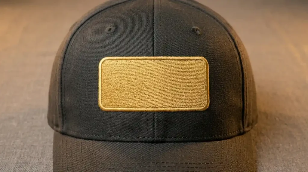
- Dark cap + dark background + light text = subtle, premium look (e.g., black cap, charcoal background, gold text)
- Light cap + no background needed = light caps usually provide enough contrast naturally
Avoid matching the background color too closely to the hat. A background that blends into the fabric defeats the entire purpose.
Need help choosing thread colors that work on your specific cap? Our team at Sassy Digitizing offers a free consultation before every order.
DIY Digitizing vs. Professional Digitizing for Hat Backgrounds
DIY Digitizing
- Control: Full control over every setting
- Time: Requires learning software like Wilcom or Hatch
- Risk: Easy to get pull compensation or sewing order wrong on cap fabric
- Best for: Single practice projects
Professional Digitizing (Sassy Digitizing)
- Control: You specify, we execute
- Time: File delivered in 4–6 hours
- Risk: In-house machine testing, guaranteed sew-out
- Best for: Client orders, bulk caps, brand logos
For professional-grade results on cap text with backgrounds, Sassy Digitizing’s cap digitizing service handles everything from background shape and stitch type to proper sewing order and pull compensation so your hats look sharp every single time.
Summary
Adding a background to text on hats is not just a design choice it is a technical necessity when contrast and legibility matter. The key steps are planning your background shape to fit the cap’s embroidery field, set it to sew first, match your pull compensation to the cap fabric, and always test on a curved surface.
Whether you handle digitizing in-house or send it to us, getting the background layer right will make the single biggest difference in how clean your hat text looks in real life.
Need a cap design digitized with a proper background layer? Contact Sassy Digitizing or place your order directly we will handle the technical side from start to finish.
About the Author
Keith Blair | Senior Quality Control (HOD) Keith Blair leads Quality Control at Sassy Digitizing with 12 years of commercial embroidery experience. He specializes in stitch density adjustments, underlay settings, and production optimization for 3D puff, appliqué, and small lettering projects.