When you need to change embroidery lettering to fill stitch, it is usually because satin stitch is failing on your larger letters. The columns are splitting down the middle, the thread looks uneven, and the whole word loses its clean professional look. The fix is straightforward but only if you know exactly which letters to change, what settings to use, and how to apply fill stitch correctly so the letters still look sharp.
This guide walks you through the complete process step by step.
Why Satin Stitch Fails on Large Embroidery Letters
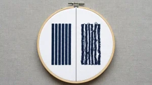
Satin stitch works beautifully on narrow columns. For letters under 6mm in width, it produces a smooth, shiny surface that looks polished and professional. But once a letter column gets wider than 6mm, satin stitch starts to break down.
The long threads that cross the letter have nothing anchoring them in the middle. They loosen, split, and sag. The result looks uneven and unprofessional even when the digitizing and tension settings are perfectly correct. This is not a machine problem or a thread problem. It is simply the physical limit of satin stitch on wide columns.
This is also one of the core reasons behind messy embroidery lettering that refuses to look clean regardless of how many times you adjust your machine settings. The stitch type itself is the wrong choice for the size.
The Rule: Any letter column wider than 6mm should use fill stitch, not satin stitch.
Step 1: Identify Which Letters Need to Change
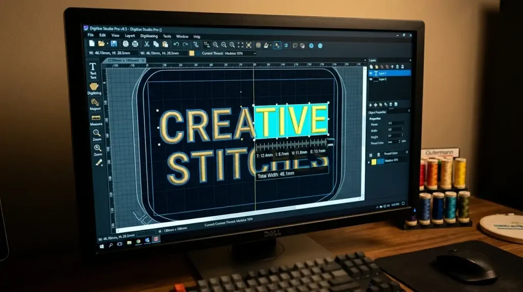
Open your design in your embroidery digitizing software and measure the column width of each letter in the text.
In Wilcom and most professional digitizing tools, you can click on any letter object and check its maximum column width in the properties panel.
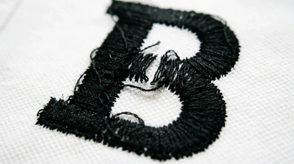
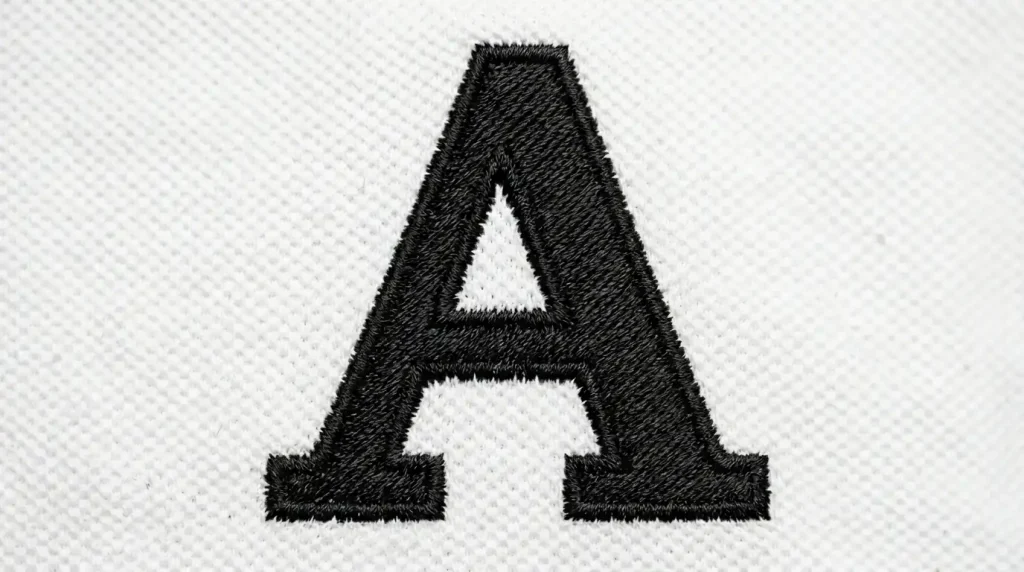
Flag every letter where the widest point of any stroke exceeds 6mm. These are the letters that need to be converted from satin stitch to fill stitch. Narrow letters like “I”, “l”, and “1” can usually stay as satin stitch. Wide letters like “O”, “G”, “B”, “W”, and “M” almost always need converting when used at large sizes.
Step 2: Switch the Stitch Type in Your Software
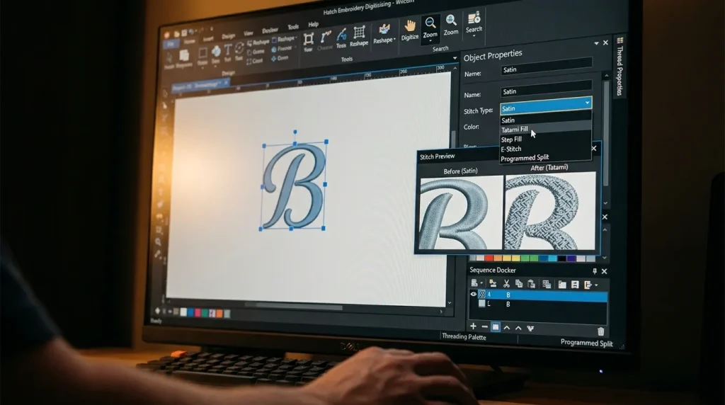
Select the letter object in your cap digitizing or garment design file. In the stitch properties panel, change the stitch type from Satin to Tatami Fill or Step Fill the exact name depends on your software but the function is the same in all major tools.
Key settings to configure after switching:
- Stitch Length: Set between 3mm and 4mm for most fill stitch lettering
- Row Spacing: 0.4mm to 0.45mm for standard weight fabrics
- Stitch Angle: 45 degrees is the default this gives the most balanced, even look across the letter surface
- Edge Padding: Add 0.3mm to 0.5mm to ensure fill stitches reach the letter outline cleanly without gaps
Do this for every flagged letter in the design. If your text has multiple words, check every character individually letter widths vary even within the same word.
Step 3: Set the Fill Stitch Angle Correctly
The fill stitch angle determines how the rows of stitching run across each letter. This is a detail many embroiderers overlook, but it significantly affects the final appearance.
45 degrees is the standard starting point for most lettering. It distributes the stitches evenly and avoids a striped or directional look that can make letters seem unbalanced.
For designs where multiple letters sit next to each other, you can alternate the fill angle between letters for example 45 degrees on one letter and 135 degrees on the next. This subtle variation breaks up the repetitive texture and gives the word a more refined, professional look overall.
Avoid using 0 degrees or 90 degrees on fill stitch lettering. Horizontal or vertical fill rows tend to create a very mechanical, grid-like appearance that looks less polished than an angled fill.
After setting the angle, also check that your underlay is correctly configured for fill stitch lettering. A center run underlay works well for most letter shapes. For very wide letters, a double zigzag underlay provides better support. If you are unsure which underlay to use, our guide on why your embroidery is sinking and how underlay stitches fix it covers every underlay type in detail.
Step 4: Add an Outline Stitch to Define the Letter Edges
Once the fill stitch is applied, the letter edges can sometimes look slightly soft compared to the sharp look of satin stitch. Adding a thin satin stitch outline around each converted letter solves this cleanly.
Set the outline column width to between 0.8mm and 1.2mm. This is narrow enough to stay stable as a satin stitch while being wide enough to define the letter shape clearly against the garment fabric.
This outline-plus-fill combination is exactly the same technique used in professional embroidery digitizing services for bold text on uniforms, jacket backs, and sportswear where letters need to be both large and sharp at the same time. For large jacket back designs where this technique is used extensively, see our breakdown of how a complex jacket back was digitized in 6 hours.
DIY Conversion vs. Professional Digitizing

Converting satin stitch lettering to fill stitch requires access to proper digitizing software and familiarity with stitch properties. If you are using basic machine software or auto-digitizing tools, these controls are either hidden or not available at all and auto-digitizing will almost never make this conversion correctly on its own.
If you need bold text lettering digitized correctly for large sizes whether for uniforms, caps, jackets, or promotional apparel Sassy Digitizing handles this manually for every design. Our digitizers check column widths, assign the correct stitch type per letter, set fill angles, and add outlines where needed. We do not use auto-digitizing shortcuts every file is hand-built using Wilcom for the cleanest possible output. You can see why that matters in our comparison of manual digitizing versus AI auto-digitizing.
Summary
Changing embroidery lettering to fill stitch is the correct solution when satin stitch columns are too wide to stay stable. Here is the complete process:
- Measure every letter flag any column wider than 6mm for conversion
- Select the letter object and switch stitch type from Satin to Tatami or Step Fill
- Set fill angle to 45 degrees and stitch length between 3mm and 4mm
- Add a thin satin outline to sharpen the letter edges after filling
For professionally digitized lettering at any size, check our digitizing services and pricing or send your design directly to Sassy Digitizing and our team will handle every detail.
Frequently Asked Questions (FAQs)
1. When should I use fill stitch instead of satin stitch for lettering? Use fill stitch on any letter column wider than 6mm. Below 6mm, satin stitch is fine. Above 6mm, satin stitch will split and look uneven.
2. What fill stitch type is best for embroidery letters? Tatami fill or Step fill gives the cleanest result on lettering. Both produce a flat, even surface that holds its shape across wide letter strokes.
3. Does fill stitch look as sharp as satin stitch on letters? It looks different less shiny, more matte and flat. Adding a thin satin outline around each fill-stitched letter brings back the sharp edge definition that satin stitch naturally provides.
4. Can I convert satin letters to fill stitch in any embroidery software? Yes, in professional software like Wilcom, Hatch, and Brother PE-Design. Basic machine software may not offer this level of stitch type control professional digitizing software is required.
About the Author
Keith Blair | Senior Quality Control (HOD) Keith Blair serves as the Head of Department for Quality Control at Sassy Digitizing, bringing 12 years of commercial embroidery experience to the team. He specializes in stitch density, underlay construction, and pull and push compensation adjustments across all fabric types ensuring every digitized file is production-ready before it reaches the customer.