Small embroidery letters collapse into unreadable blobs for one reason: the digitizing settings are wrong for the size. The machine is not at fault. The thread is not at fault. Column width, font choice, and density settings cause every small letter failure. This guide explains each cause and gives you the specific fix.
Why Small Embroidery Letters Fail
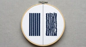
Embroidery letters are built from satin stitch columns. Each stroke of each letter is a satin column parallel threads running back and forth across the stroke width. At large sizes, these columns stitch cleanly with space between letters and open counter spaces inside them. However, at small sizes, three things break down at once.
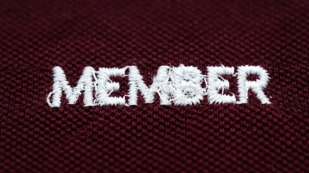
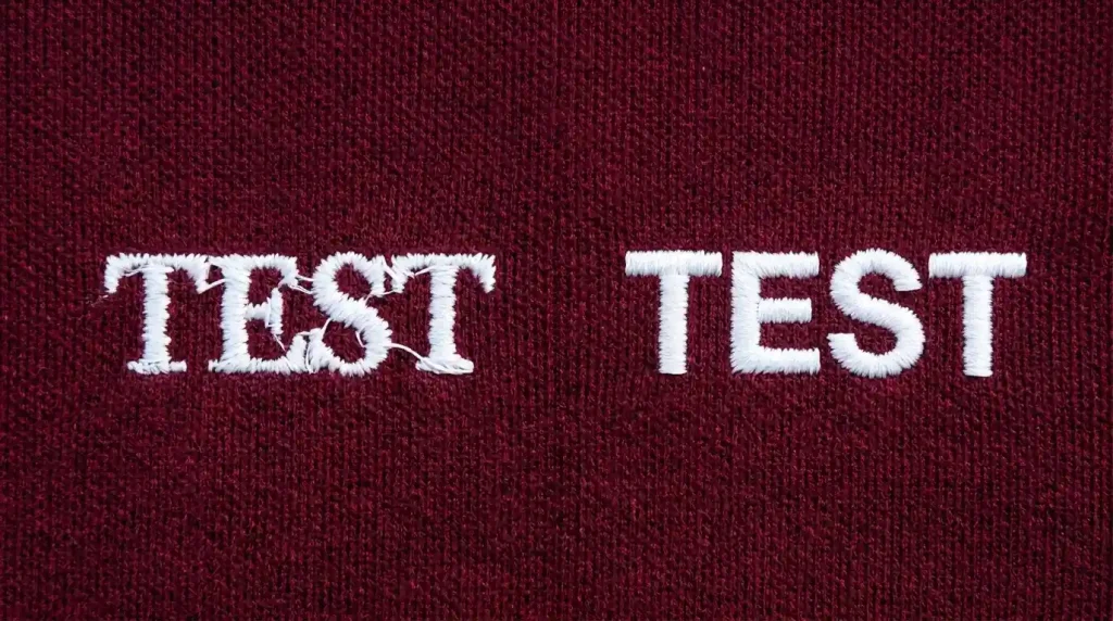
Column Width Becomes Too Narrow Letter strokes under 1mm in column width are too narrow for clean stitching. The needle punches through threads it already laid down instead of landing beside them. This creates a tangled, merged appearance.
Counter Spaces Fill With Thread Enclosed spaces inside letters like O, B, D, and P are called counter spaces. They should remain open fabric. At small sizes, adjacent satin columns land inside the counter space and fill it with thread. As a result, the counter disappears and the letter loses its shape.
Letter Spacing Collapses The physical distance between adjacent letters shrinks until the satin stitches of one letter land on top of the next. Two separate letters become one merged blob.
All three problems connect directly to why embroidery lettering looks messy on any garment the column width and counter space issues are the same at every scale, just amplified at small sizes.
Step 1: Know the Minimum Readable Letter Height
Before adjusting any settings, understand the hard limits of what embroidery can physically stitch at small sizes.
Minimum letter heights for clean embroidery:
- Block or sans-serif fonts: 5mm to 6mm minimum letter height
- Serif fonts: 7mm minimum the serifs add complexity that requires more space
- Script or decorative fonts: 8mm to 10mm minimum thin strokes and connecting elements need maximum column width to survive
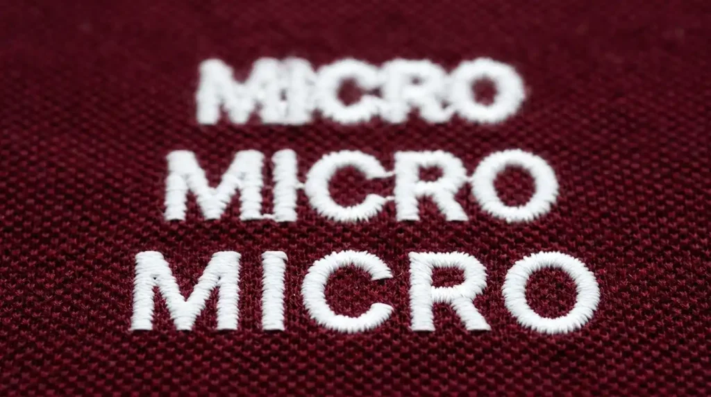
Anything below these minimums will not stitch cleanly. At 3mm to 4mm, even perfect digitizing cannot produce readable letters. The physical needle size makes clean column separation impossible at that scale.
If your design requires text below these minimums, you have two options. First, increase the text size. Second, remove the text element and replace it with a simpler element that works at that scale. Some elements simply cannot survive size reduction and must be simplified or removed.
Step 2: Switch to the Right Font for Small Size
Font choice is the biggest factor in whether small embroidery letters are readable. Open your design in your digitizing software and check what font the small text element uses.
Fonts that work at small embroidery sizes:
- Clean sans-serif block fonts uniform stroke width, no thin elements, maximum column width at every point
- Bold condensed fonts wide strokes relative to letter height keep columns above the minimum width threshold
- Simple monogram fonts at larger sizes only when minimum height requirements are met
Fonts that fail at small embroidery sizes:
- Thin serif fonts serifs are typically under 0.5mm at small sizes and cannot stitch as individual elements
- Script and cursive fonts connecting strokes between letters create merging that is unavoidable below 8mm
- Decorative display fonts irregular stroke widths create some columns that are too narrow and others that are too wide within the same letter
Switch to a bold sans-serif font for any text under 8mm letter height. This single change resolves more small text problems than any other setting adjustment. It applies equally to changing lettering approach in fill stitch versus satin stitch decisions font structure determines whether any stitch type can render the letters cleanly.
Step 3: Adjust Column Width and Density for Small Text
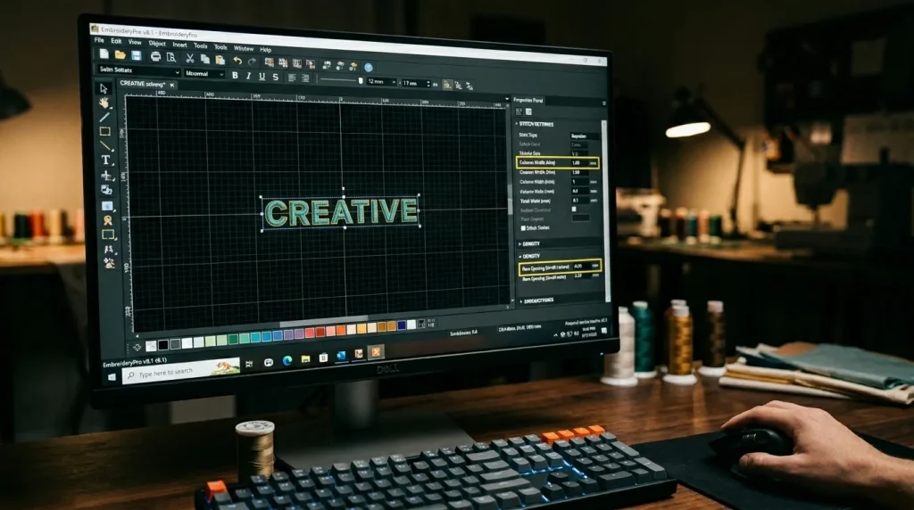
After switching to the correct font, open the letter object properties in your digitizing software. Then make these three adjustments:
Minimum Column Width 1mm Set a minimum column width of 1mm for every letter stroke in the small text object. In Wilcom and most professional software, find this under minimum column width or compensation settings. Any stroke that falls below 1mm must be widened or removed it cannot stitch cleanly below this threshold.
Increase Row Spacing for Small Satin Columns For small satin stitch lettering, increase row spacing to 0.5mm instead of the standard 0.4mm to 0.45mm. This prevents over-density in narrow columns. Standard density in narrow columns packs too many thread passes into too small a space. Consequently, the column builds up and overflows into adjacent counter spaces. Looser density keeps each pass clean and separate.
Increase Letter Spacing Slightly In the text object properties, increase tracking by 10% to 15% above the default. This creates more physical distance between adjacent letters and prevents the satin stitches of one letter from landing on the edge of the next.
These settings work together with the correct font choice. Neither the font change nor the column width adjustment works fully in isolation both are needed for consistently clean small cap digitizing text and garment text results.
Step 4: Test on the Actual Fabric Before Production
Small text behaves differently on different fabric surfaces. A setting that produces clean letters on a woven polo may still show merging on a soft knit beanie. The knit surface moves under the needle and closes the gaps between letter strokes.
Always run a physical test stitch on your production fabric before committing to a full run. Check the result under normal lighting from arm’s length the distance a typical viewer reads embroidered text from. If individual letters are not clearly distinguishable, increase letter height or simplify the font before proceeding.
For cap embroidery with small text specifically, also verify that your cap digitizing settings for hats and caps account for the curved panel surface which compresses letter spacing slightly differently than flat garment fabric does.
DIY Fix vs. Professional Digitizing

Getting small embroidery letters right requires professional digitizing software and the ability to set minimum column width, tracking, and density independently for each text object.
Auto-digitizing tools use generic settings for every file. They do not evaluate font suitability for the size, do not enforce minimum column widths, and do not adjust letter spacing for small scale. The result is exactly the merged, unreadable text that sends embroiderers looking for machine adjustments that can never fix a digitizing problem.
At Sassy Digitizing, our digitizers evaluate every text element checking font suitability, minimum column width, letter spacing, and density before the file is delivered. Our manual approach using Wilcom is precisely why manual digitizing outperforms AI auto-digitizing on detailed text work. Check our digitizing services and pricing to get your small text digitized correctly.
Summary
Small embroidery letters fail because of three specific digitizing problems. Fortunately, all three are fixable in the file:
- Fix 1: Respect minimum letter height 5mm to 6mm for block fonts, 7mm for serif, 8mm+ for script
- Fix 2: Switch to a bold sans-serif font for any text under 8mm letter height
- Fix 3: Set minimum column width to 1mm, increase row spacing to 0.5mm, and add 10% to 15% letter spacing tracking
For professionally digitized small text that stitches cleanly on the first run, Sassy Digitizing handles every setting manually. Visit our digitizing services page to get started.
FAQs
1. What is the minimum size for embroidery letters? For clean readable results, block and sans-serif fonts need a minimum letter height of 5mm to 6mm. Serif fonts need 7mm minimum. Script and decorative fonts need 8mm to 10mm. Below these sizes, letters merge and lose their shape regardless of settings.
2. Why do small embroidery letters merge together? Letter strokes become too narrow for clean satin column separation, counter spaces inside letters fill with thread from adjacent columns, and letter spacing shrinks until adjacent letters overlap. All three causes are fixed through font choice, minimum column width, and tracking adjustments in the digitizing file.
3. What font works best for small embroidery text? Bold sans-serif block fonts work best for small embroidery text. They have uniform stroke widths, no thin serif elements, and maximum column width at every point in every letter all of which are essential for clean stitching at reduced sizes.
4. Can I make very small embroidery text readable by changing machine speed? No. Letter readability at small sizes is entirely determined by the digitizing file font choice, column width, and density settings. Machine speed does not affect how close together satin stitch columns land relative to each other.
About the Author
Keith Blair | Senior Quality Control (HOD) Keith Blair serves as the Head of Department for Quality Control at Sassy Digitizing, bringing 12 years of commercial embroidery experience to the team. He specializes in stitch density, underlay construction, and pull and push compensation adjustments across all fabric types ensuring every digitized file is production-ready before it reaches the customer.